Pink Power Real Estate
Logo design for an ethical real estate investor
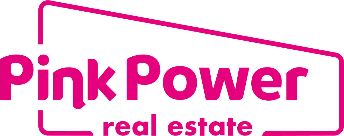
Pink Power Real Estate seeks to give people a place to live while being ethical to both tenants and landlords, and holistically solving the housing crisis. This business was entirely new, so the logo was developed from scratch. The primary target audience for this business included real estate investors, contractors, lenders, and property managers.
Final Design
The logo uses a customized version of Braah One and Futura Bold to bring a punchy and friendly quality. A soft rectilinear shape with a low angle implies the shape of contemporary architecture. A vibrant pink color had personal significance to the business owner.


Creative Process
I conducted a discovery interview with the business owner, did a small competitive audit of local real estate investors, and curated a few architectural reference images that resonated with the owner.
I explored concepts by sketching out ideas, and developing them as rough vector shapes. Then, it was a matter of narrowing and refining the most appropriate concept.


"Jacob made a gorgeous logo in a short period of time! He never disappoints and always does high quality work. Thanks for the amazing logo!"

President, Pink Power Real Estate


